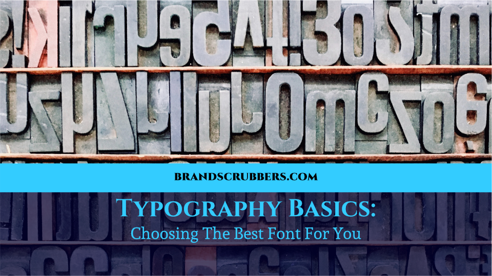
Hello again! Today, I thought we’d take a look at some typography basics in this post.
Now, typography is a pretty huge field. In fact, you can take entire degrees focused on it, but, if you’re reading this, chances are you don’t plan on becoming the next Max Miedinger (creator of the famous Helvetica font). So, with this in mind, I’ve compiled some basic typography tips and tricks that I’ll be sharing with you over the next few weeks.
Before we begin, a pretty important distinction needs to be made. Typography is not just fonts. And fonts are not typography. Many people use these terms interchangeably, but in reality, a font is one aspect within typography. This is a huge pet peeve for most designers, and knowing the difference between these terms will ensure that any conversation you have with one will be substantially less painful.
Plus, armed with your super awesome new knowledge, you’ll be able to typographize effectively in no time! So, on that note, let’s begin with some definitions.
TYPOGRAPHY DEFINED
Typography itself is the visual representation of a word, focusing on readability, accessibility, and appearance. A font, on the other hand, is the style of the actual words (think Times New roman).
Back in the printing press days, what we now consider a font, was actually called a typeface, and the individual styles and sizes were called fonts. So, this means that Times New Roman is a typeface, and 8pt Times New Roman would be the font.
However, thanks to the advent of digital design, and Microsoft Office, most people now consider typeface and font as interchangeable, which is becoming more and more acceptable within the design community.
Today, we’re going to focus on choosing the right font for your business. Having the right font for your business is part of typography basics.
Choosing a font may seem like a small detail, but in reality, the font you choose for your business can have a huge effect on how your brand is seen. Think about the ill-fated comic sans for instance, if you were to see a lawyer’s office using this font for their logo, chances are you’d skip right past them and head to literally anyone else. There’s even a petition in Australia to ban the font,
Poor little Comic Sans. Anyways…
Making the right choice when it comes to fonts for your business can make a huge difference for your brand, and having a basic understanding of this will ensure that you choose the right ones for your business.
FONT STYLES
There are two major classifications of font styles. Serif and Sans-serif. Serif fonts include extra little features (called serifs) on each of the letterforms, and sans-serif, are well, sans a serif.
Before the digital age, the general rule of thumb was that serif fonts were best used for large bodies of text, and sans-serif fonts were used as headlines or titles. This is due to the serifs being more easily distinguishable by readers – leading to increased readability.
When it comes to designing for web, however, this idea gets turned on its head. This is because printed materials have a higher resolution, meaning that if you try to use a serif font online, the computer can’t display the serifs as clearly as it would on a printed product. So, it is generally recommended to use sans-serif fonts for large bodies of text online.
However, as with anything in design, there are other considerations to look at when determining if serif or sans-serif is the right choice for your business. First, what types of applications do you plan on using the font for? Are you creating a website with tons of written content? Or, is the font strictly for headlines, or even your logo?
If the font is for your logo, it’s a great idea to look up examples of serif and sans-serif style logos to get an idea for the feel of each. Generally speaking, serif fonts
give off a more traditional, classic and formal feel, whereas sans-serif fonts are seen as modern, clean and simple.
This is another opportunity for you to really hone in on what you want your brand to say to your clients. Are you friendly and approachable? Or, perhaps, tradition and professionalism is the name of your game. Either way, choosing the right font will ensure that your clients know exactly what you stand for, and help draw in the right audience for your business.
Be sure to check in next week for part 2 of the typography series, where I’ll explain how to mix serif and sans-serif fonts effectively, and maybe even share some of my favourite resources.
Until next time,
Stephanie Butler
Trackbacks/Pingbacks